Sometimes it's the little things that impress me about a new OS release. For instance, during a fresh install, Ubuntu detected my time-zone so I didn't have to carefully pinpoint it on the map. There's now an installer slideshow while you wait the usually short (around 15 mins on an average PC) time until it completes. Once it finished and rebooted I was amazed at the boot time, booting in seconds, I barely had time to admire the new boot-splash screen!

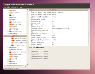
The default desktop now looks pretty slick, feeling similar to OSX, especially with the default wallpaper and title-bar button layout. However, if like me you prefer it how it used to be, it's fairly easy to change. (click the screenshot for a better view).
 1. Press ALT + F2 to get a run box
2. type gconf-editor and press return
3. Navigate to Apps --> metacity --> general
4 Find the entry "button_layout"
5. Double click "close,minimize,maximise" on the right-hand side.
6. Edit the entry so it reads: "menu:minimize,maximize,close"
7. hit enter and you're done :)
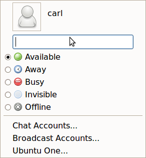
One of the main features of this release is the new MeMenu. Once you have setup your chat accounts in Empathy (now the default messenger client) or Pidgin (which i still prefer), you can now update your Facebook and/or Twitter status from the text box in the MeMenu. Ideal for a quick tweet! By default it updates both FB and Twitter, but if you want, you can set just one in Gwibber, Ubuntu's default social media tool. I've been using it since 9.10/Karmic, and it has become even better in Lucid. Tweets now show up in speech bubbles and it's easier to differentiate between others and your own tweets. My only niggles are the buttons to select just Facebook or Twitter are too similar in shade. It is also still impossible to retweet a full, 140 character tweet, as it counts the 'RT @username' bit as part of this tweet.
MeMenu:

Gwibber:

Overall, 10.0.4 feels like a slicker, improved OS over the previous 9.10 (Karmic) release, a worthy upgrade, especially considering it is an LTS (Long Term Support) which means you won't have to upgrade for a long time if you don't want to. The only other niggle I had to attend to the volume control applet to the main panel was missing from startup items (add gnome-volume-control-applet to startup items), but easily fixed. This is the first time I haven't immediately changed the theme on a fresh install. The slick new theme is a refreshing change from the previous yucky brown releases, unless you were the minority who really were into brown. I should also mention the Ubuntu Software Centre has improved since last time, it feels a lot easier to find and install packages now. There's also the new Ubuntu One Music Store integrated into Rhythmbox, that I have yet to fully play with but seems to be a good alternative to the iTunes store. Ubuntu One is more integrated this time and actually connected at login every time, unlike in Karmic.
Download Ubuntu here.
Ubuntu has been my main and only OS on my laptop for several months.
ReplyDeleteI did the upgrade route to 10.04LTS so the changed where not immediately noticeable, the window controls where still in the right hand top corner for instance. Agreed on the volume control - easy fix like you mention.
I have had a couple of issues that were not present before. The system froze up for the first time ever since installing Linux - only the once though. Totally lost all sound today so not knowing a way to recover it I had to do a reboot (yuck). Also I am noticing a strange brief flicker now and again across the bottom quarter of the screen.
I am going to stick with it as is and hope it sorts itself out with updates or easy fixes as right now I do not have the life to spare for a fresh install.